Paper mode
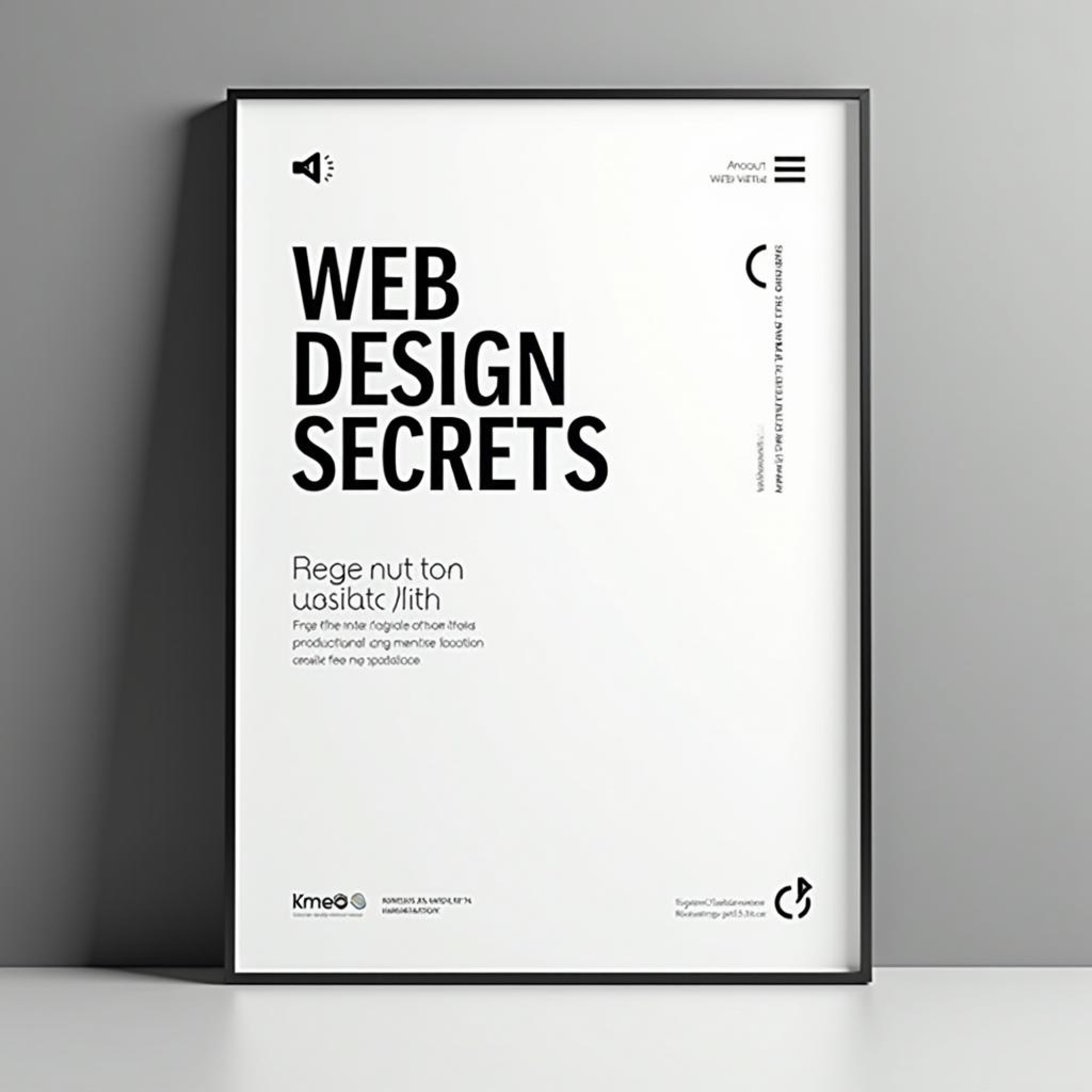
Mastering Layouts and Grids
Organize your designs with purpose and precision using layouts and grids.
Grids are an essential tool for designers, providing structure and consistency in both digital and print layouts. Learn how to implement grids in your work to create more professional and cohesive designs.
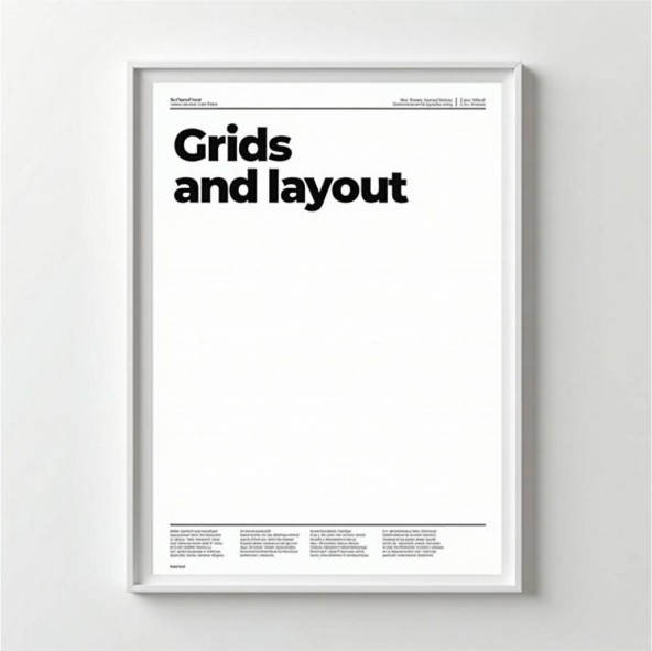
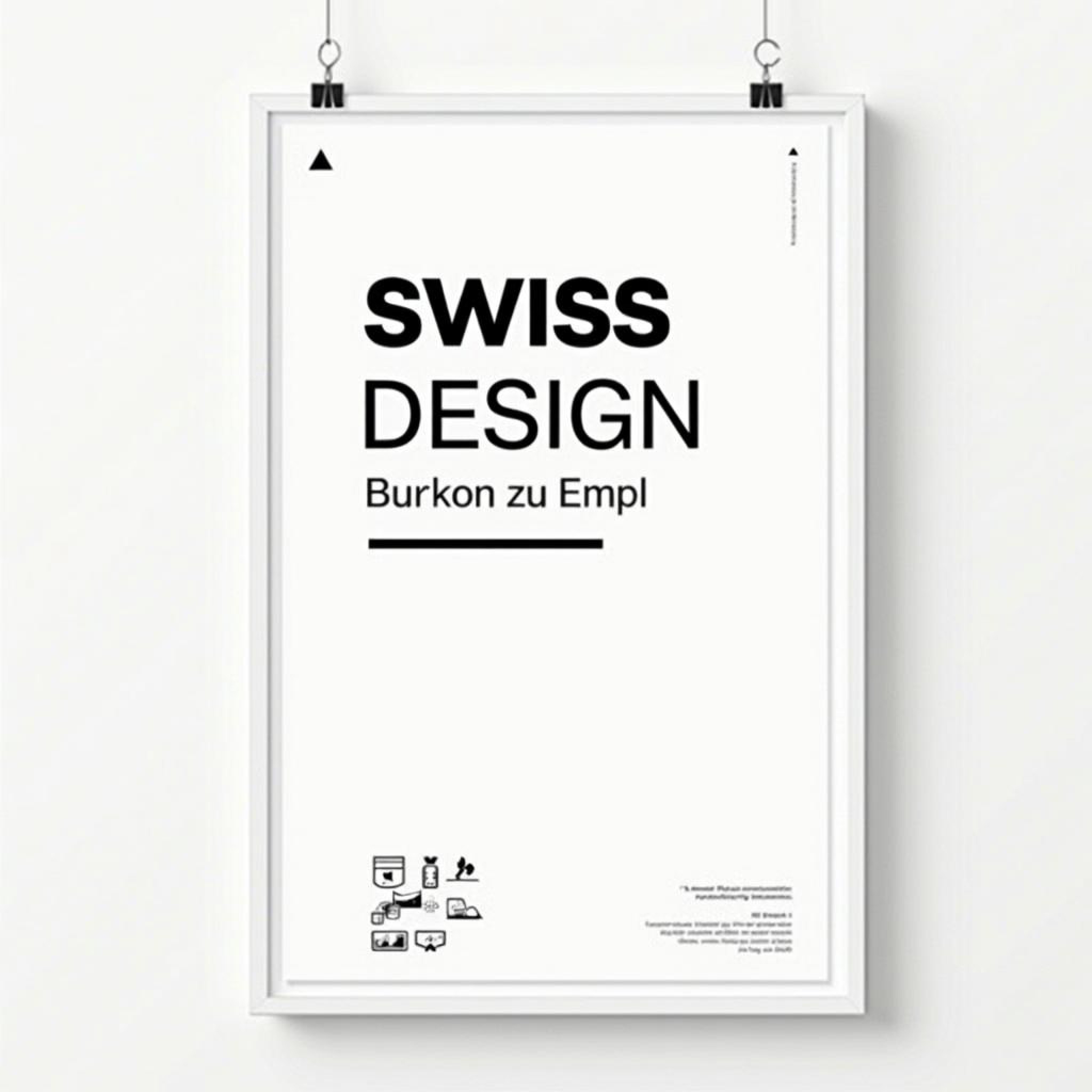
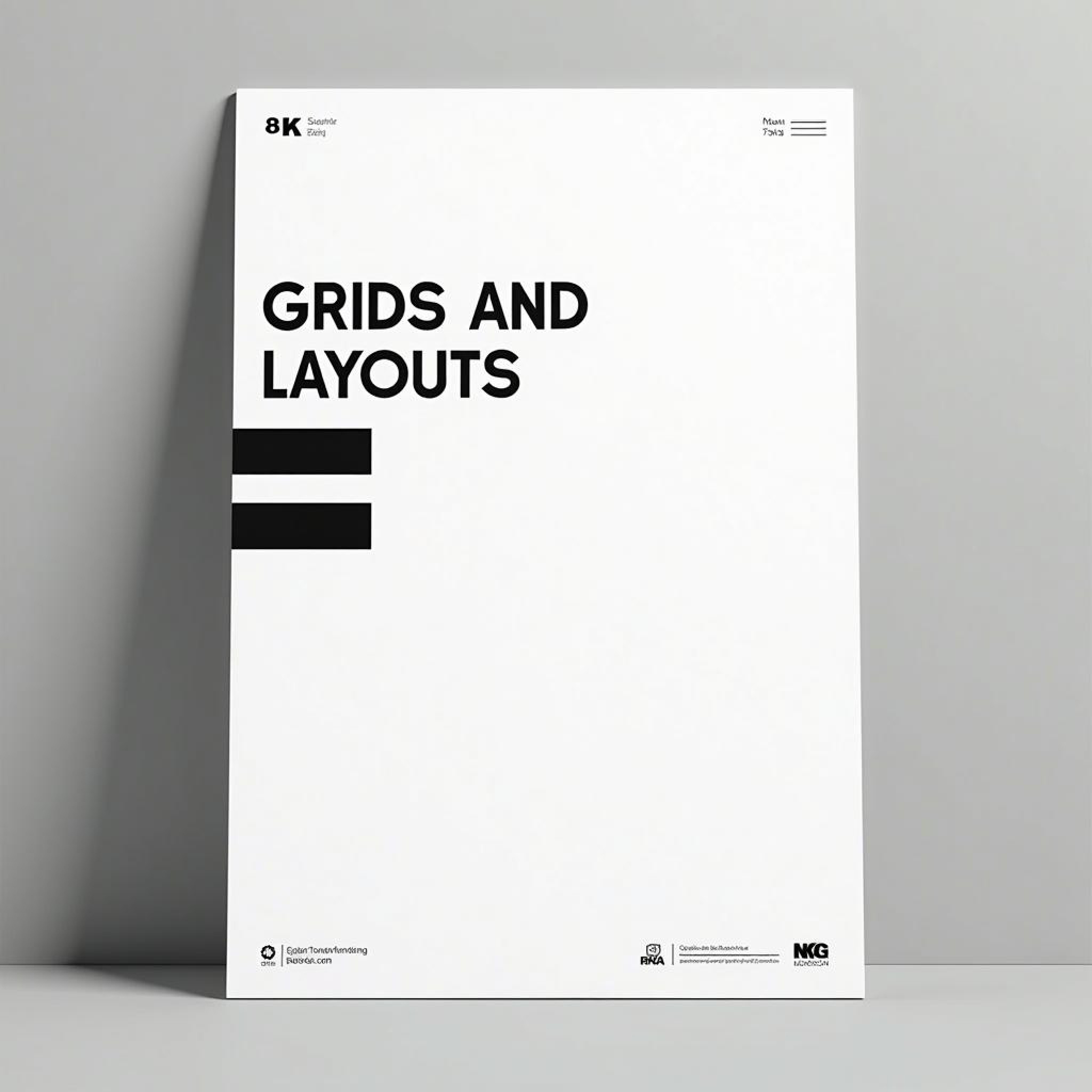
In the world of design, whether print or digital, structure and organization are fundamental. This is where layouts and grids become indispensable tools, serving as the skeleton of any design. At their core, layouts provide the overall structure, while grids offer the system that maintains order and alignment. When used correctly, they ensure that every element within a design is positioned deliberately, guiding the viewer’s eye and conveying information in a cohesive, easy-to-digest manner. One of the key benefits of grids is the ability to create a visual hierarchy. When used in a layout, grids help prioritize content, from the most critical information to supporting details. Imagine a newspaper page: the bold headline sits at the top, immediately grabbing attention, while smaller text and sub-headlines guide the reader through the article. The grid system ensures that everything is aligned, making the page appear clean and organized. Grids are also vital in maintaining consistency throughout a design. Consistency isn’t just about looking neat—it’s about enhancing the user’s experience. A well-organized design ensures that users don’t have to expend extra energy to figure out where things are or what to look at next. By implementing a grid, you create a natural flow, helping users navigate the content intuitively. In fact, much of modern web design is built around grid systems, particularly responsive design frameworks like Bootstrap, which allow for flexible and consistent layouts across different screen sizes. In the digital world, grids have become essential for responsive design. Today’s users access websites and apps on a variety of devices, and grids provide a flexible framework that adapts to different screen sizes while maintaining alignment and structure. Without a grid, a design can easily become chaotic, especially when scaling from a large desktop monitor to a small mobile screen. By using a responsive grid system, designers can ensure that their layouts remain intact, regardless of the platform. One of the most famous uses of grids comes from the Swiss design movement, where grids became a cornerstone of minimalistic, functional design. The Swiss grid system is characterized by its clean lines, symmetrical arrangements, and the careful balance between content and white space. This approach has influenced modern graphic design, typography, and even architecture, showcasing how essential grids are to creating order and balance in a design. For beginners, working with grids may feel restrictive, but over time, designers come to appreciate how grids provide the freedom to experiment within a structured framework. Once you master the grid, you can start to play with its rules—breaking away from rigid alignment to create visual interest while still maintaining a sense of order. Ultimately, the power of grids lies in their ability to make content more accessible and engaging. When elements are aligned properly, when text and images follow a clear structure, the design becomes less about the individual parts and more about the whole experience. This holistic approach is what sets professional designs apart from amateur ones, making grids one of the most critical tools in a designer’s arsenal.
More Blogs
Books related to Layouts and Grids


Paper mode
Mastering Layouts and Grids
Organize your designs with purpose and precision using layouts and grids.
Grids are an essential tool for designers, providing structure and consistency in both digital and print layouts. Learn how to implement grids in your work to create more professional and cohesive designs.
In the world of design, whether print or digital, structure and organization are fundamental. This is where layouts and grids become indispensable tools, serving as the skeleton of any design. At their core, layouts provide the overall structure, while grids offer the system that maintains order and alignment. When used correctly, they ensure that every element within a design is positioned deliberately, guiding the viewer’s eye and conveying information in a cohesive, easy-to-digest manner. One of the key benefits of grids is the ability to create a visual hierarchy. When used in a layout, grids help prioritize content, from the most critical information to supporting details. Imagine a newspaper page: the bold headline sits at the top, immediately grabbing attention, while smaller text and sub-headlines guide the reader through the article. The grid system ensures that everything is aligned, making the page appear clean and organized. Grids are also vital in maintaining consistency throughout a design. Consistency isn’t just about looking neat—it’s about enhancing the user’s experience. A well-organized design ensures that users don’t have to expend extra energy to figure out where things are or what to look at next. By implementing a grid, you create a natural flow, helping users navigate the content intuitively. In fact, much of modern web design is built around grid systems, particularly responsive design frameworks like Bootstrap, which allow for flexible and consistent layouts across different screen sizes. In the digital world, grids have become essential for responsive design. Today’s users access websites and apps on a variety of devices, and grids provide a flexible framework that adapts to different screen sizes while maintaining alignment and structure. Without a grid, a design can easily become chaotic, especially when scaling from a large desktop monitor to a small mobile screen. By using a responsive grid system, designers can ensure that their layouts remain intact, regardless of the platform. One of the most famous uses of grids comes from the Swiss design movement, where grids became a cornerstone of minimalistic, functional design. The Swiss grid system is characterized by its clean lines, symmetrical arrangements, and the careful balance between content and white space. This approach has influenced modern graphic design, typography, and even architecture, showcasing how essential grids are to creating order and balance in a design. For beginners, working with grids may feel restrictive, but over time, designers come to appreciate how grids provide the freedom to experiment within a structured framework. Once you master the grid, you can start to play with its rules—breaking away from rigid alignment to create visual interest while still maintaining a sense of order. Ultimately, the power of grids lies in their ability to make content more accessible and engaging. When elements are aligned properly, when text and images follow a clear structure, the design becomes less about the individual parts and more about the whole experience. This holistic approach is what sets professional designs apart from amateur ones, making grids one of the most critical tools in a designer’s arsenal.
More Blogs
Books related to Layouts and Grids
Paper mode
Mastering Layouts and Grids
Organize your designs with purpose and precision using layouts and grids.
Grids are an essential tool for designers, providing structure and consistency in both digital and print layouts. Learn how to implement grids in your work to create more professional and cohesive designs.
In the world of design, whether print or digital, structure and organization are fundamental. This is where layouts and grids become indispensable tools, serving as the skeleton of any design. At their core, layouts provide the overall structure, while grids offer the system that maintains order and alignment. When used correctly, they ensure that every element within a design is positioned deliberately, guiding the viewer’s eye and conveying information in a cohesive, easy-to-digest manner. One of the key benefits of grids is the ability to create a visual hierarchy. When used in a layout, grids help prioritize content, from the most critical information to supporting details. Imagine a newspaper page: the bold headline sits at the top, immediately grabbing attention, while smaller text and sub-headlines guide the reader through the article. The grid system ensures that everything is aligned, making the page appear clean and organized. Grids are also vital in maintaining consistency throughout a design. Consistency isn’t just about looking neat—it’s about enhancing the user’s experience. A well-organized design ensures that users don’t have to expend extra energy to figure out where things are or what to look at next. By implementing a grid, you create a natural flow, helping users navigate the content intuitively. In fact, much of modern web design is built around grid systems, particularly responsive design frameworks like Bootstrap, which allow for flexible and consistent layouts across different screen sizes. In the digital world, grids have become essential for responsive design. Today’s users access websites and apps on a variety of devices, and grids provide a flexible framework that adapts to different screen sizes while maintaining alignment and structure. Without a grid, a design can easily become chaotic, especially when scaling from a large desktop monitor to a small mobile screen. By using a responsive grid system, designers can ensure that their layouts remain intact, regardless of the platform. One of the most famous uses of grids comes from the Swiss design movement, where grids became a cornerstone of minimalistic, functional design. The Swiss grid system is characterized by its clean lines, symmetrical arrangements, and the careful balance between content and white space. This approach has influenced modern graphic design, typography, and even architecture, showcasing how essential grids are to creating order and balance in a design. For beginners, working with grids may feel restrictive, but over time, designers come to appreciate how grids provide the freedom to experiment within a structured framework. Once you master the grid, you can start to play with its rules—breaking away from rigid alignment to create visual interest while still maintaining a sense of order. Ultimately, the power of grids lies in their ability to make content more accessible and engaging. When elements are aligned properly, when text and images follow a clear structure, the design becomes less about the individual parts and more about the whole experience. This holistic approach is what sets professional designs apart from amateur ones, making grids one of the most critical tools in a designer’s arsenal.