Paper mode
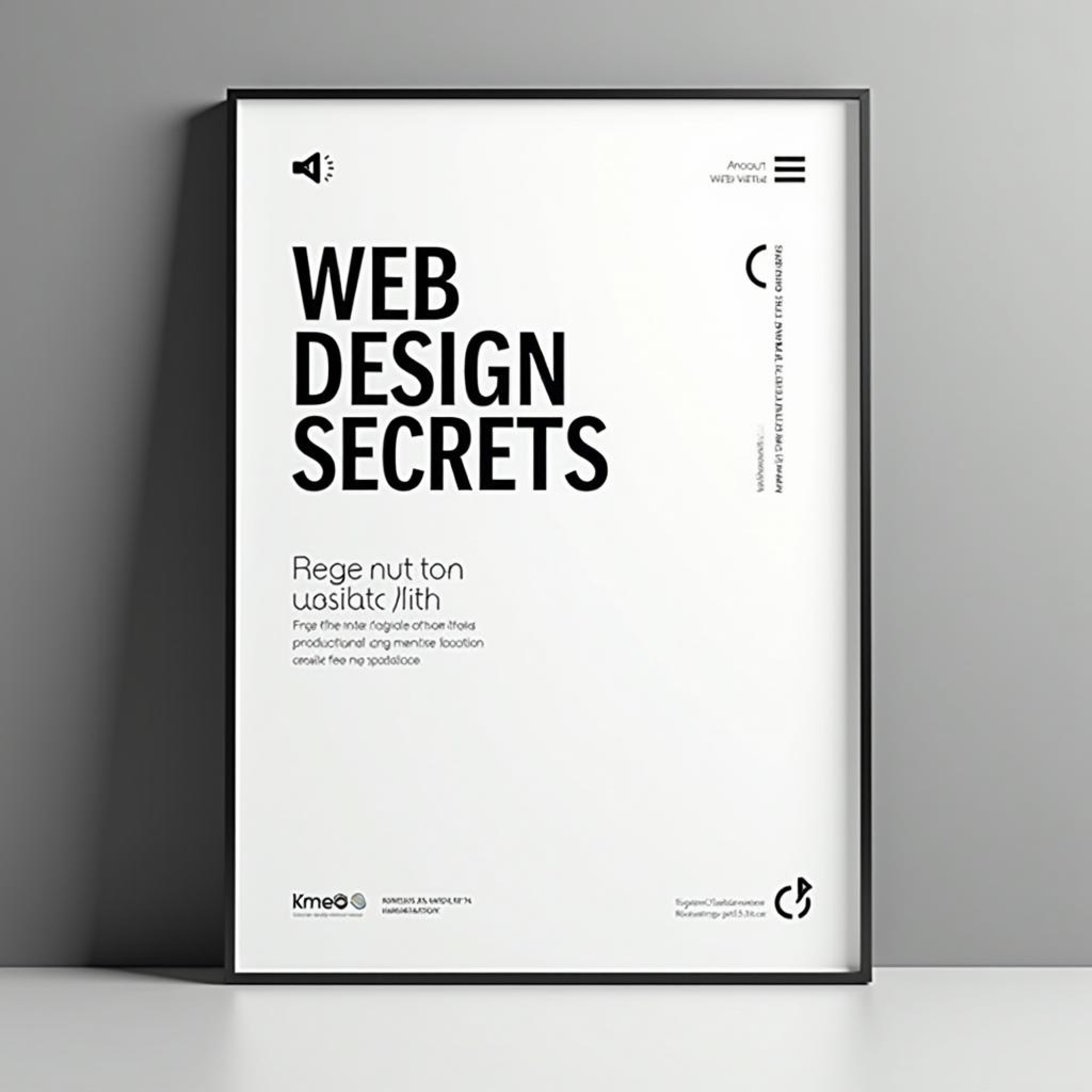
Typography in Design
Learn how typography can elevate your design and convey powerful messages
Typography is more than just selecting a font—it’s an art form that influences how users perceive and interact with your designs. Discover how thoughtful font choices can dramatically enhance your work.
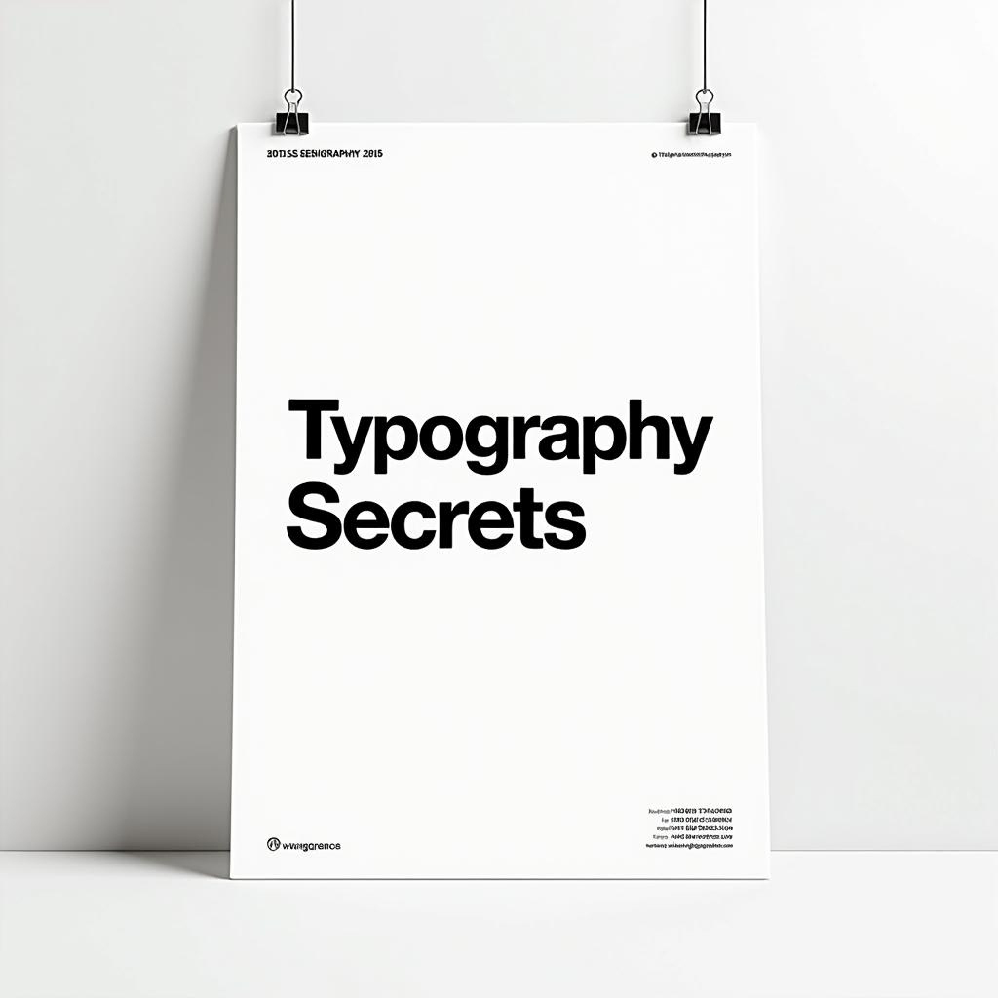
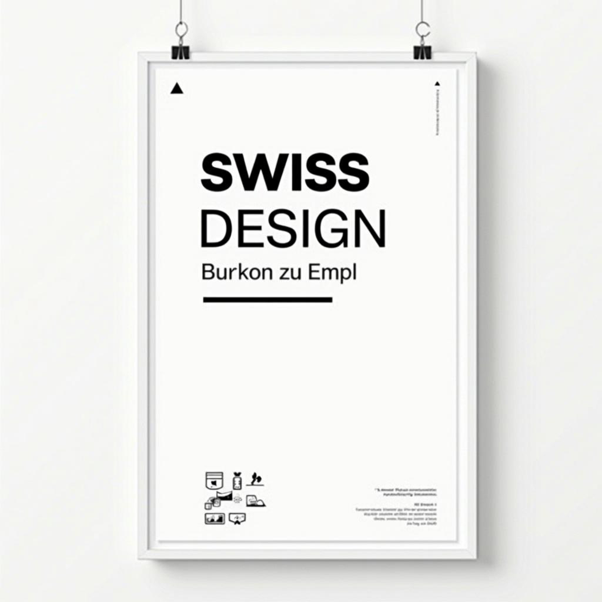
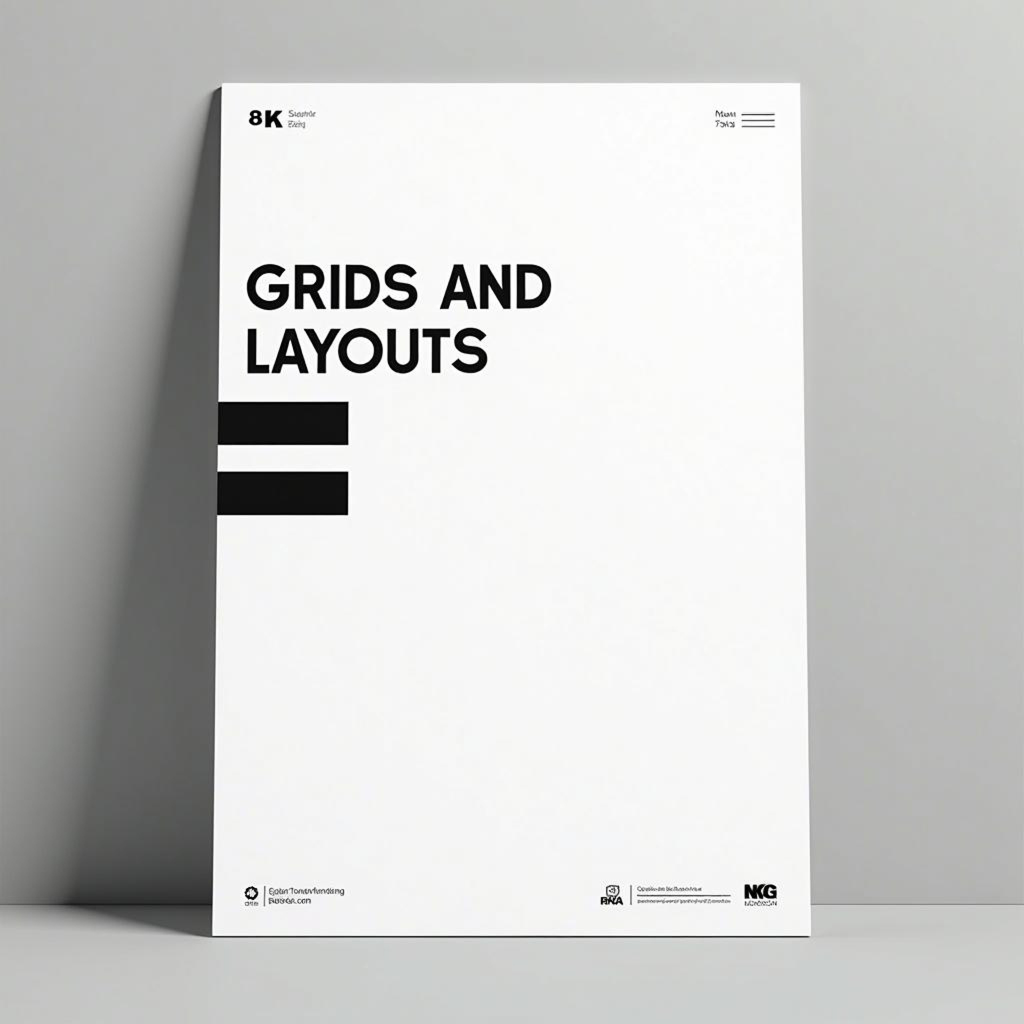
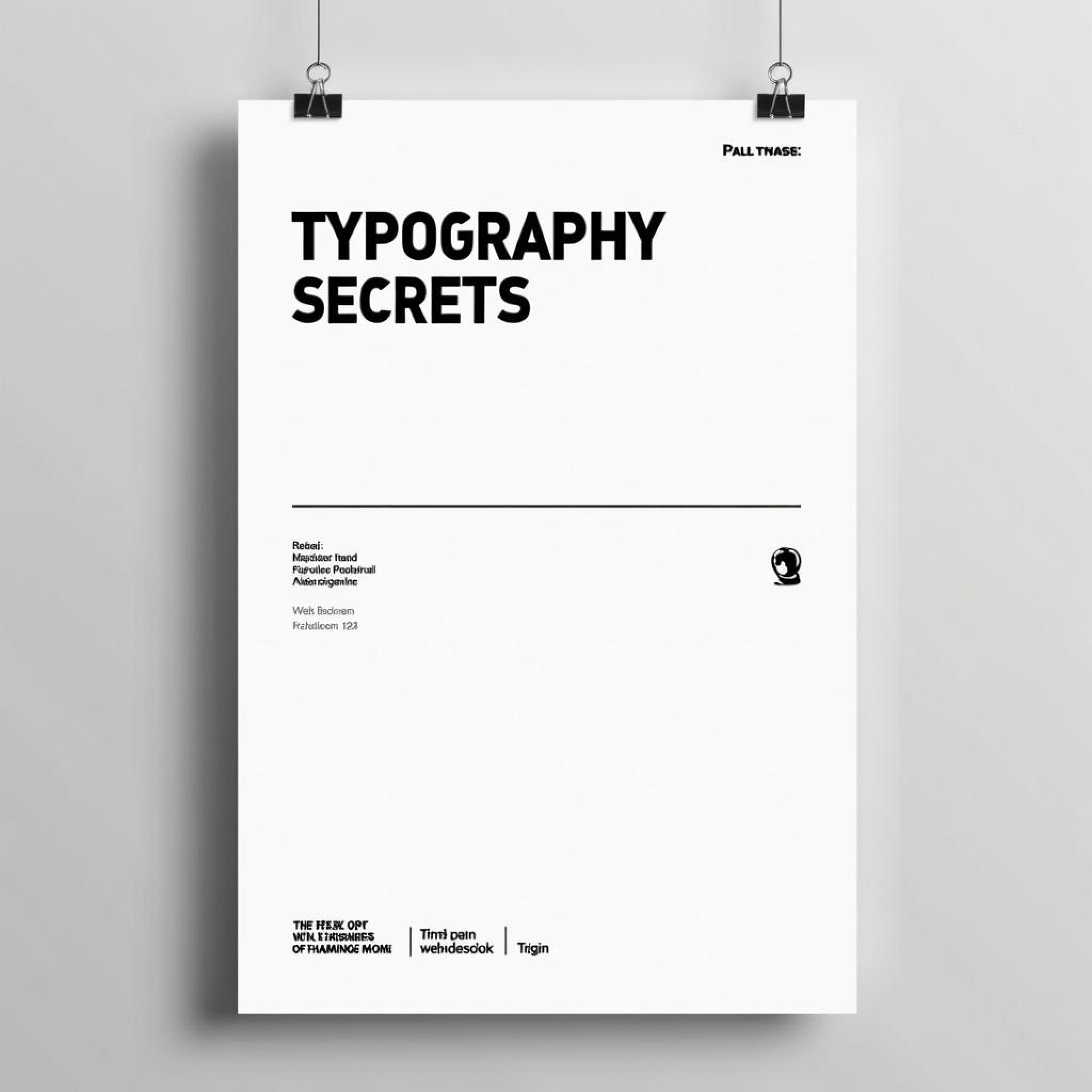
Typography is one of the most fundamental elements of design, yet it often goes overlooked, especially by beginners. Many assume that typography is simply the act of choosing a font. But in reality, typography is much more nuanced and plays a critical role in how a message is communicated. From setting the tone of a design to influencing readability and creating hierarchy, typography has the power to make or break the user experience. The first thing to understand about typography is that it’s more than just the choice of font—it’s about creating a system that harmonizes with the other elements of your design. Fonts, sizes, spacing, line height, and alignment all come together to form a cohesive visual language. In print, this means ensuring that the reader can easily follow the text. In digital design, typography needs to adapt to different screen sizes and resolutions while maintaining legibility and aesthetics. The psychological impact of typography cannot be understated. Each font carries with it a specific personality and mood. Serif fonts, with their classic, formal look, evoke tradition and professionalism, making them popular in print media such as newspapers and books. On the other hand, sans-serif fonts are clean, modern, and often associated with tech companies or digital platforms. Display fonts, which are usually more decorative, are perfect for making bold statements in headlines but can be overwhelming if overused. Hierarchy is another critical aspect of typography. By varying the size, weight, and color of your text, you can guide the viewer’s attention to the most important elements first. For example, headlines are typically bold and large to grab attention, while body text is smaller and easier to read over long stretches. Subheadings break up content and help the reader navigate through different sections, providing both structure and clarity. Readability is one of the most important aspects of typography. No matter how beautiful a font may look, if the text is difficult to read, the design has failed. This is where factors such as leading (the space between lines of text), kerning (the space between individual letters), and alignment come into play. These details may seem insignificant, but they have a significant impact on how easily the content can be read. For example, a narrow line spacing might make a block of text feel cramped and overwhelming, while too much spacing can make it hard for the eye to follow. With the rise of responsive web design, typography has had to evolve to accommodate different screen sizes. What looks great on a desktop may not be legible on a mobile device. This is where responsive typography comes into play—using flexible units like ems or rems allows the text to scale dynamically, ensuring it remains readable on any device. Moreover, web fonts have opened up a whole new world for designers, allowing them to go beyond system fonts to create unique and personalized typographic experiences. Typography also plays a significant role in accessibility. Ensuring that your text is legible for all users, including those with visual impairments, is crucial. This can involve choosing high-contrast colors, ensuring sufficient font sizes, and avoiding overly decorative fonts that may be hard to decipher. When done correctly, typography can elevate a design from good to great. It can convey mood, emotion, and meaning in ways that images and layout cannot. Typography has the power to turn a simple message into a memorable one, making it one of the most important tools in any designer’s toolkit.
More Blogs
Books related to Typography


Paper mode
Typography in Design
Learn how typography can elevate your design and convey powerful messages
Typography is more than just selecting a font—it’s an art form that influences how users perceive and interact with your designs. Discover how thoughtful font choices can dramatically enhance your work.
Typography is one of the most fundamental elements of design, yet it often goes overlooked, especially by beginners. Many assume that typography is simply the act of choosing a font. But in reality, typography is much more nuanced and plays a critical role in how a message is communicated. From setting the tone of a design to influencing readability and creating hierarchy, typography has the power to make or break the user experience. The first thing to understand about typography is that it’s more than just the choice of font—it’s about creating a system that harmonizes with the other elements of your design. Fonts, sizes, spacing, line height, and alignment all come together to form a cohesive visual language. In print, this means ensuring that the reader can easily follow the text. In digital design, typography needs to adapt to different screen sizes and resolutions while maintaining legibility and aesthetics. The psychological impact of typography cannot be understated. Each font carries with it a specific personality and mood. Serif fonts, with their classic, formal look, evoke tradition and professionalism, making them popular in print media such as newspapers and books. On the other hand, sans-serif fonts are clean, modern, and often associated with tech companies or digital platforms. Display fonts, which are usually more decorative, are perfect for making bold statements in headlines but can be overwhelming if overused. Hierarchy is another critical aspect of typography. By varying the size, weight, and color of your text, you can guide the viewer’s attention to the most important elements first. For example, headlines are typically bold and large to grab attention, while body text is smaller and easier to read over long stretches. Subheadings break up content and help the reader navigate through different sections, providing both structure and clarity. Readability is one of the most important aspects of typography. No matter how beautiful a font may look, if the text is difficult to read, the design has failed. This is where factors such as leading (the space between lines of text), kerning (the space between individual letters), and alignment come into play. These details may seem insignificant, but they have a significant impact on how easily the content can be read. For example, a narrow line spacing might make a block of text feel cramped and overwhelming, while too much spacing can make it hard for the eye to follow. With the rise of responsive web design, typography has had to evolve to accommodate different screen sizes. What looks great on a desktop may not be legible on a mobile device. This is where responsive typography comes into play—using flexible units like ems or rems allows the text to scale dynamically, ensuring it remains readable on any device. Moreover, web fonts have opened up a whole new world for designers, allowing them to go beyond system fonts to create unique and personalized typographic experiences. Typography also plays a significant role in accessibility. Ensuring that your text is legible for all users, including those with visual impairments, is crucial. This can involve choosing high-contrast colors, ensuring sufficient font sizes, and avoiding overly decorative fonts that may be hard to decipher. When done correctly, typography can elevate a design from good to great. It can convey mood, emotion, and meaning in ways that images and layout cannot. Typography has the power to turn a simple message into a memorable one, making it one of the most important tools in any designer’s toolkit.
More Blogs
Books related to Typography
Paper mode
Typography in Design
Learn how typography can elevate your design and convey powerful messages
Typography is more than just selecting a font—it’s an art form that influences how users perceive and interact with your designs. Discover how thoughtful font choices can dramatically enhance your work.
Typography is one of the most fundamental elements of design, yet it often goes overlooked, especially by beginners. Many assume that typography is simply the act of choosing a font. But in reality, typography is much more nuanced and plays a critical role in how a message is communicated. From setting the tone of a design to influencing readability and creating hierarchy, typography has the power to make or break the user experience. The first thing to understand about typography is that it’s more than just the choice of font—it’s about creating a system that harmonizes with the other elements of your design. Fonts, sizes, spacing, line height, and alignment all come together to form a cohesive visual language. In print, this means ensuring that the reader can easily follow the text. In digital design, typography needs to adapt to different screen sizes and resolutions while maintaining legibility and aesthetics. The psychological impact of typography cannot be understated. Each font carries with it a specific personality and mood. Serif fonts, with their classic, formal look, evoke tradition and professionalism, making them popular in print media such as newspapers and books. On the other hand, sans-serif fonts are clean, modern, and often associated with tech companies or digital platforms. Display fonts, which are usually more decorative, are perfect for making bold statements in headlines but can be overwhelming if overused. Hierarchy is another critical aspect of typography. By varying the size, weight, and color of your text, you can guide the viewer’s attention to the most important elements first. For example, headlines are typically bold and large to grab attention, while body text is smaller and easier to read over long stretches. Subheadings break up content and help the reader navigate through different sections, providing both structure and clarity. Readability is one of the most important aspects of typography. No matter how beautiful a font may look, if the text is difficult to read, the design has failed. This is where factors such as leading (the space between lines of text), kerning (the space between individual letters), and alignment come into play. These details may seem insignificant, but they have a significant impact on how easily the content can be read. For example, a narrow line spacing might make a block of text feel cramped and overwhelming, while too much spacing can make it hard for the eye to follow. With the rise of responsive web design, typography has had to evolve to accommodate different screen sizes. What looks great on a desktop may not be legible on a mobile device. This is where responsive typography comes into play—using flexible units like ems or rems allows the text to scale dynamically, ensuring it remains readable on any device. Moreover, web fonts have opened up a whole new world for designers, allowing them to go beyond system fonts to create unique and personalized typographic experiences. Typography also plays a significant role in accessibility. Ensuring that your text is legible for all users, including those with visual impairments, is crucial. This can involve choosing high-contrast colors, ensuring sufficient font sizes, and avoiding overly decorative fonts that may be hard to decipher. When done correctly, typography can elevate a design from good to great. It can convey mood, emotion, and meaning in ways that images and layout cannot. Typography has the power to turn a simple message into a memorable one, making it one of the most important tools in any designer’s toolkit.